
 |
| The Old BBC News Website |
 |
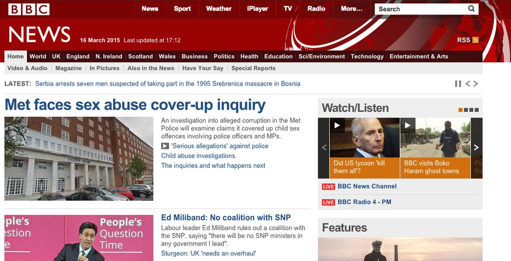
| The New BBC News Website |
Personally, I think the new BBC News website is pretty. Despite having eyes that are very sensitive to light, I really don't find the vast amount of white space that annoying. That having been said, that is not to say that I do not feel the new BBC News website is vastly inferior to the old one. Quite simply, the new website is much harder to navigate. The biggest problem I have with the site's navigation is with regards to the various regions of the various countries that comprise the United Kingdom. For example, on the old site the BBC News England page had a box that included a map of England (as well as the Crown dependency of the Isle of Man and the Crown possessions of Jersey and Guernsey) along side a list of the various regions and cities in those regions. Under each city were a list of news stories associated with that area. It was then very easy to find news from the various regions of England.
Unfortunately, on the new website there seems to be no logical listing of the various regions. As a result one must click upon the "Regions" tab at the top, then click on each region one by one to see news from that region. As might be expected, this is much more time consuming. Indeed, I think it would be regardless of whether one is using a PC, tablet, or mobile phone. In the end I think BBC News might see visitors to the site become increasingly frustrated with having to click link after link to get where they are going. And, unfortunately, many of those users might stop using the BBC News website as a result.
Another complaint I have, and one that has been expressed by many other visitors to the BBC News website, is that the web pages on the new BBC News website seem to have less content than the ones on the old site. Indeed, the old website had sidebars on the right that were filled with various news stories. On the new website there is only a sidebar for videos and audios under the heading "Watch/Listen" and another sidebar with the heading "Most Popular" which features a rather meagre listing of headlines. From the various comments about the new website, it seems that many visited the BBC News website because they could get more news on one page than many other news sites. For people like that (including myself), the new website is a real step backwards.
Now it is true that any time there are changes to a website there will be those who are very vocal in their criticisms. And often it is simply a minority who dislikes the changes to the website. In the case of BBC News, however, it seems to me that not only has reaction to the new site been overwhelmingly negative, but it seems to me that many of the criticisms are quite valid. In other words, these are not people complaining simply because they hate change, but because something they had found useful has become less so. A site they once found easy to navigate has now become much more difficult.
In the end I think the new BBC News website will really need to be changed dramatically before most of its users are happy with it. While I really had no objection to it, given the number of complaints about "white space" they might want to rethink the site's colour scheme and layout. Given the complaints about the site's font, they might want to change that as well. Most importantly, at least from my perspective, they need to make the navigation easier to use. I honestly think the box containing the various regions that appeared on BBC News England, BBC News Northern Ireland, BBC News Scotland, and BBC News Wales was a great idea, and one that they should have kept. And I rather suspect if they want to keep visitors to the site, then they should probably bring it back. A news site does little good if the news is difficult to find on it.

No comments:
Post a Comment